Posts tonen met het label versamark. Alle posts tonen

vrijdag 27 mei 2016

Nuts about you


Dag bloggers,
 
Hi bloggers,
 
We zijn weeral aan het einde van de maand,
dus hebben jullie van mij nog 1 ‘Pink & Main’ projectje te goed.
Deze keer eens geen hondjes. Er zijn zelfs een heleboel nieuwe stempels van dit leuke nieuwe merk binnen gekomen in de winkel…
 
It's almost the end of the month ... so one last Pink & Main project from me.
This time no puppies, but  no worries, there are so many lovely new stamps to choose from 
from this new brand.
 
 
Voor deze kaart, haalde ik een al iets oudere snijmallenset van Sizzix uit de kast. Daar sneed ik de basiskaart mee en ook het voorste deel van de kaart en de rondjes. Er zitten wel 11 snijmallen in deze set, die allemaal op de basiskaart passen…
 
For this card I took an older Sizzix die set from which I cut the basecard with the  decoration for the front panel and the circles .... this set has 11 dies, among them several to decorate the basecard,
so no fuzzycutting needed ...
 
 
Een bijpassend papiertje van Galeria Papieru vooraan en met Versamark gestempelde
eikels op het achterste deel van de kaart.
Eekhoorn vooraan en uiltje binnenin…
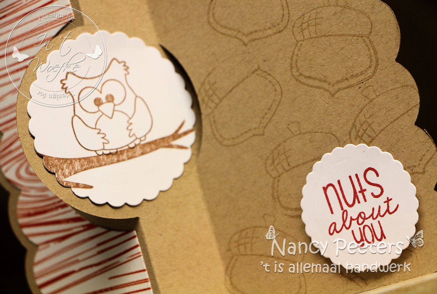
 
 
I choose a suitable paper from Galeria Papieru for the front and on the back I stamped the acorns with Versafine. A little squirrel on the front and a little owl on the back .... to finish it off
Een eerste herfstkaartje? Je zou het bijna gaan denken met het weer van de afgelopen dagen…
 
So, what are you thinking .... an early autumn card? Well you might think so with the weather we've had these last couple of days ....
 
 
Benieuwd naar de andere stempels van Pink & Main? Snel gaan kijken… Je vind zeker iets wat je leuk vind en waarmee je aan de slag kan gaan… Nu we het toch over de herfst hebben… Weten jullie dat de eerste Halloween-stempels al zijn binnen gekomen?
 
Curious what else Pink & Main has to offer? Hurry to In 't Woefke ... you'll sure to find something fun to start stamping with .... speaking about fall ....
did you know the first Halloween stamps arrived in the store ?
 
Juni wordt een super leuke maand bij in ’t Woefke! Ik kan alvast vertellen dat je de volgende maand overstelpt gaat worden onder ‘de beestjes’… We roepen juni uit tot maand van de…  Oeps, nee, dat ga ik nog niet verklappen… Blijf dit blog volgen en jullie komen er vanzelf achter…
 
June will be a fun month at In 't Woefke ! I can tell you next month you'll be swamped with critters ... From now on July will be known as ... oops, sorry, can't tell you yet ... But stay tuned and follow this blog and you'll find out soon enough ....
Misschien tot op één van de workshops bij ‘in ’t Woefke’… Raadpleeg zeker de workshop-kalender en reserveer snel jullie plaatsjes…
 
Maybe we'll see each other at one of the workshop at In 't Woefke ... don't forget to check the workshop calendar and be sure to reserve your place at the table on time ...
 
Tot een volgend project alweer!
 
Till my next project !
 
Liefs,
 
Nancy

vrijdag 8 januari 2016

Chocolate Baroque Landscape Collage


Hallo iedereen,
 
Hi everyone,
 
De uitdaging voor het DT is deze maand Chocolate Baroque, en natuurlijk kan ik dan niet achterblijven ... en daarom ging ik ook aan de slag met deze prachtige stempels.
Toegegeven, soms is het iets meer nadenken .... maar dat is ook een uitdaging hè. En toen ik éénmaal begon ... kon ik niet meer stoppen LOL
 
The challenge this moth for our DT is Chocolate Baroque, and as usual I try to participate also, so without delay I played some with these gorgeous stamps.
Although I must admit, it took a bit more time to think about my cards ...
but hey that's why it's a challenge right?! And once I got started ... I just couldns't stop playing LOL
 
Voor m'n eerste projektje heb ik de stempel Landscape Collage gebruikt,
 ... en wel in héél speciale kleuren!
Wie mij kent weet dat ik niet zo'n gek ben van Turquoise, al begin ik het wel meer en meer te appreciëren op kaarten e.d., maar ik wou eens iets helemaal anders doen dan wat ik normaal zou doen en geen echte natuurkleuren gebruiken, ... en ik denk wel dat het gelukt is turquoise met roze LOL 
 
For my first project I used the stamp Landscape Collage ... Normally I would use real nature colors for such a stamp, but I decided to go completely out of my comfort zone and use colors that I normally would never use on a landscape: teal (those peope that know me, know this is not my favorite color, although I do appreciate it more and more on cards and such) 
and I combined it with pink
 
 
Ik heb de stempel zelfs 2x afgedrukt op aquarel papier, en dan heb ik van 1 plaatje
het middenste deel (rechthoek) uitgesneden.
Deze heb ik eerst geblend met Tumbled Glass (de zon en de bloemen liet ik zoveel mogelijk zonder kleur) en dan in de hoeken nog wat Broken China. Nu vielen de wolken niet echt meer op in de achtergrond, dus nam ik een vochtig penseel, maakte de wolken vochtig en depte ze dan af met een tissue, zo werden de wolken veel bleker en dit herhaalde ik - telkens met een proper penseel - tot ik tevreden was van het resultaat.
 
I stamped the image twice and I cut from 1 image the middle out (rectangle).
This piece I blended with Tumbled Glass (I left the son and flowers as pale as possible) and added a bit of Broken China in the corners.
The clouds didn't show enough, so I took a wet brush and colored them with water and then I took a tissue and dabbed them dry. I repeated this when necessary with a clean brush untill I was satisfied.
 
Dan nam ik mijn penseel, en bracht nog wat Picked Raspberry aan op de zon/maan en de bloemen. Voor de boom en enkele bolletjes tussen de bloemen, gebruikte ik
WOW Totally Teal embossing poeder. Om het af te werken, nam ik een zwarte stift
en ging ik langs de randen tot er geen wit meer te zien was...
 
Then I took my brush and added some Picked Raspberry on the sun/moon and the flowers.
For the tree and some elements between the flowers I used WOW Totally Teal embossing powder. To finish my card I used a black marker so the white doesn't show anymore.
 
Voor het 2de plaatje heb ik de rand rondom ingekleurd met m'n penseel met wat Picked Raspberry, Tumbled Glass / Broken China en Dusty Concord. Daarna heb ik Versamark rondom aangebracht (marker en pad) en heb ik wat WOW Purple Glitz Glitter embossing poeder aangebracht en verhit.
 
For the 2nd stamped image, I colored the edges with a brush and Picked Raspberry, Tumbled Glass / Broken China and Dusty Concord. Then I used Versamark around the edges (marker and pad) and added WOW Purple Glitz Glitter embossing powder.
 
De 2 stukken heb ik op elkaar gekleefd en dan nog de achterkant van SEI wintersong papier en dat alles op een kaart aangebracht. Nog 1 van m'n eigen tekststempels erop die er wel bij past
en de kaart is af.
 
Finally I attached both pieces on the backside of SEI winterson paper and attached it on a card; I stamped one of my own textstamps on it, and my card was ready .
 
Zo, ik hoop dat dit jullie inspireert om zelf met deze mooie stempels aan de slag te gaan, binnenkort zien jullie nog meer Chocolate Baroque .
 
So, I hope I inspired you to start playing with these gorgeous stamps, soon you'll see more of Chocolate Baroque.
 
Groetjes
 
Inge

dinsdag 11 augustus 2015

Your Smile


Hoi bloggers,
 
Hi,
 
Nadat ik mijn vorige projectje maakte besefte ik dat het best wel al een tijdje geleden was dat ik nog eens met mijn stencils had gewerkt dus bij deze ^.^
 
After making my previous project I realized it had been a long time since I took out my stencils.
 
Ik nam twee verschillende stencils die perfect bij elkaar aansluiten om dit CAS kaartje te maken. Het kan voor heel veel verschillende gelegenheden gebruikt worden, je hoeft enkel de tekst aan te passen.
 
So today I made a card with two different stencils that match perfectly. It’s a CAS card that fits all different kind of occasions all you have to do is adjust the text.
 
Natuurlijk nog even wat spatten en een kleine Memorybox vlinder om mijn kaartje af te werken ^.^
 
And of course just get some splatters on the card and a little Memorybox butterfly to finish off my card ^.^
 
Groetjes – Greetz
 
Veerle
 
Gebruikte materialen / Used materials
 
Aquarelpapier Canson
Stencils : Memorybox – The Crafters Workshop
Dies: Memorybox
Stempel/stamp: Kaiserkraft – Unity stamps
Inkt/ink: versamark – stazon~black
Distressinkt: Victorian velvet – shabby shutters
blendingtool
Zwart embossingpoeder

vrijdag 17 juli 2015

Every Summer has a Story


Dag Bloggers,
 
Hi Bloggers,
 
Je zou het niet alle dagen zeggen, maar het is volop zomer, dus deze maand ga ik jullie wat zomerse kaartjes tonen…
 
You wouldn't Always say it, but it is summer, so this month I'm going to show you some cards that just scream summer ....
 
Voor deze eerste ben ik alvast heel erg ‘out of the box’ gegaan…
Niet voor het formaat, ik maak liefst van al kaarten van 15/15 cm daar voel ik me echt confortabel mee…
 
For the first one I really went out of my comfort zone ... not because of the size, I love making 6" x 6" cards and feel very comfortable with it ....
 
 
Maar toen ik Inge vertelde wat ik van plan was en de gepaste stempels zocht om op mijn kaarten te zetten, heeft ze me een beetje uitgedaagd met een stijl die ik absoluut niet zelf zou kiezen… en weet je, ik vond het fijn om ze te kunnen maken.
 
But when I told Inge what I was up to, and that I needed to find some stamps that fit my cards, she kind of challenged me with a style that I would never have chosen myself .... and you know what? I liked making them !
 
Deze eerste kaart heb  ik gemaakt met een achtergrondstempel van ‘Impression Obsession’  Ik hou van deze stempels omdat ze zo lekker groot zijn en de hele kaart kunnen bedekken.
 
For this card I used a background stamp from 'Impression Obsession'. I love these stamps because they are big and cover up the whole card.
 
 
Ik stempelde met versamark en emboste met WOW (Vintage Peacock)
Ook de stempel van de zeemeermin (Stampendous) emboste ik met dezelfde inkt en embossing.
Ik kleefde het geheel op een donker turkooise kaart en matte de zeemeermin op dezelfde kleur papier. De tekst is van Joy.
Nog een lintje uit mijn voorraad en klaar was ook deze kaart alweer.
 
I stamped the background with Versmark and embossed it with WOW (Vintage Peacock) .
The mermaid from Stampendous was stamped and embossed in the same way and then I've put it allon a dark teal card and matted the mermaid on the same color cardstock.
The text is from Joy and I added a ribbon from my own stash and the card was ready.
 
 
Ik hoop dat jullie de uitdaging aan durven gaan om ook een keer met WOW embossingpoeder aan de slag te gaan…
Hou alvast dit blog in de gaten, want er volgt nog meer van dit…
 
I hope you are all up for a challenge and give the WOW embossing powders a try ... Don't forget to keep an eye on this blog, because there will be more to see....
 
Tot een volgend project alweer,
 
Till my next project.
 
Liefs,
 
Nancy

donderdag 11 juni 2015

The journey is the destination

 
Hoi bloggers,
 
Hi,
 
Het is bijna vaderdag dus hier ben ik nog een keer met een mannelijke kaart. Ik gebruikte terug mijn brusho’s ( het lijkt wel of ik ze niet van mijn tafel weg krijg, ze blijven maar staan terwijl ik de rest netjes terug opberg ^.^)
 
Well it's almost father’s day (in most parts of the world) so here I am again with a male card.  Yes, I did use my brusho’s again ( I just can’t seem to get rid of them on my table ^.^)
 
De stempel van Deep Red kocht ik al een lange tijd geleden en eindelijk kon ik hem eens op een kaartje verwerken. Het is een kaartje dat heel makkelijk te maken is dus als je nog snel een kaart nodig hebt voor Vaderdag…
 
This stamp from Deep Red I bought a long time ago and finally I was able to use it on a card. It’s a quick and easy card, so if you’re in a hurry to make a father’s day card…
 
Groetjes – Greetz
 
Veerle
 
Gebruikte materialen / Used materials

 
Zwart cardstock

Aquarelpapier Canson

Brusho: vermillion – cambodge

Stempel/stamp: Deep red ~rusty truck  -  Tim Holtz~Odds and ends

Versamark inkt – Archival inkt ~zwart

Zwart embossinpoeder – black embossingpowder

Tim Holtz edge scraper


maandag 1 juni 2015

Happy colors

 
Hoi bloggers,
 
Hi,
 
Vandaag wou ik jullie graag eens iets totaal anders laten zien dan brusho of Carabelle studio stempels. Ik wil jullie immers niet vervelen dus ik nam mijn pan pastels, een stencil en mijn versamark inktkussen om aan de slag te gaan.
 
Today I wanted to show you all something completely different than brusho or Carabelle studio. Don’t want to get you bored so I took out my pan pastels, a stencil and some versamark ink.
 
 
Ik begon met het aftapen van een vierkant op mijn kaart voor ik mijn stencil plaatste.  Daarna depte ik met een versamark inktkussen direct door mijn stencil in mijn vierkant. Toen ik mijn stencil verwijderde bracht ik mijn pan pastels aan in het vierkant.  Waar de inkt zit worden de pan pastels donkerder waardoor je dit leuke motief krijgt.  Nadat ik deze kaart fixeerde kleurde ik een restje papier met dezelfde kleuren. Op de achterkant tekende ik met behulp van het stencil twee bloemetjes die ik uitknipte en op de kaart kleefde. Als hartje van mijn bloem gebruikte ik een klein beetje bling.
 
I started by taping off a square on my card before I placed my stencil. Then I tapped some versamark onto the paper through my stencil.  When I removed my stencil I could go and get my pan pastel into the square. Where there is ink the pan pastels get darker …so you get a real nice pattern in your square.  After fixing everything I colored a scrap piece of paper and used the stencil to draw 2 little flowers at the back of it. I cutted them out and glued them onto my card, using some bling as the center of my flower.
 
Voor je de tekst stempelt check je best even of je kaart wel overal helemaal droog is, anders krijg je embossingpoeder overal waar je versamark door je stencil aanbracht ;-)
 
Before stamping the text make sure your card is really dry, otherwise you will have embossingpowder all over you card sticking in the versamark you putted through your stencil ;-
 
Groetjes – Greetz
 
Veerle
 
Gebruikte materialen /Used materials:
 
Fluweelkarton
Stencil: the crafters workshop ~Spring fling
Pan pastels: 580.5 Turquoise – 470.8 violet tint
Fixatief
Versamark inkt
Tekststempels: Hero Arts
Zwart embossingpoeder
Bling steentje
Zwarte fineliner

donderdag 21 mei 2015

Buiten de lijnen kleuren

 
Hoi bloggers,
 
Hi bloggers,
 
Een tijdje terug liet ik jullie hier zien hoe ik enkel met de lijnenstempel van de Rubbernecker set Poppy Field aan de slag ging. En ook vandaag ben ik enkel met de lijnenstempel aan de slag gegaan.
En voor de verandering heb ik nog maar eens mijn brusho uit de kast gehaald ^.^
 
A while ago I showed you here how I only used the outlined stamps of the Rubbernecker set Poppy Field. And today I would like to show you a new card where I only used the outlines. And yes, I took my brusho’s again…surprise ^.^
 
 
Bij het tekstje dat ik koos  hoorde het wel eens om gewoon buiten de lijnen te gaan kleuren. Je weet wel, gewoon je leven leiden zoals jij denkt dat het goed is, niet volgens de regels die anderen je opleggen omdat het zo beter voor hun uitkomt. En vooral genieten van het leven…  Daarom heb ik dan ook gekozen om opnieuw een tweede tekstje van dezelfde stempelset aan de binnenkant te verwerken. Eentje dat perfect aansluit bij de eerste…
 
Choosing this text I had to color outside the lines. You know, just live your live, following your own rules and not the rules others want you to follow only because that fit them better. And just live and enjoy life full speed ahead. So I also have chosen a second text of the set to stamp at the inside of the card. Two texts that fit perfectly together while coloring outside the lines.
 
Groetjes – Greetz
 
Veerle
 
Gebruikte materialen / Materials used
 
Auquarelpapier
Cardstock
Stempels/stamps: Rubbernecker ~Poppy field – Penny Black ~Heartfelt
Brusho: Vermillion
Ink: versamark ( inktpad en pen)
Zwart embossingpoeder/black embossingpowder

zaterdag 9 mei 2015

Great friend

 
Hallo bloggers
 
Hi bloggers,

Vandaag haalde ik een mal van Elizabeth Crafts (accordeon circle) van onder het stof.
 
For this card I used a die from Elizabeth Crafts (accordeon circle) that I had lying around here.

De roos (impression Obsession) stempelde ik met zwarte versafine op oud Hollands papier. Nadien kleurde ik ze in met Derwent Inktense potloden. Dit zijn potloden op inktbasis. Wat je kleurt kan je nadien met water uitschilderen. In tegenstelling tot aquarelpotloden, kan je niet meer verder werken nadat je kleurwerk droog is. Zoals je in de naam hoort , de kleuren zijn intens.
 
 
The rose (Impression Obsession) was stamped with Versafine Onyx Black on Oud Hollands paper. Afterwarths I colored it with Derwent Inktense pencils. These pencils have intense colorse (as the name suggests) and what you color with the pencils can be colored out with water, but unlike watercolor pencils, once the color is dry, it is fixed and can't be changed anymore.
 
Op de groene achtergrond stempelde ik dezelfde roos enkele malen met versamark.
 
On the green background I stamped the same rose several times with Versamark.

Op naar een volgend projectje.
 
Till my next project.
 
Chris

dinsdag 31 maart 2015

Hoera

 
Quatre Foil...
is de naam van de achtergrondstempel van Impression Obession. Ik stempelde met Versamark en emboste met wit embossingpoeder van WOW. Ik kleurde de vakjes in met 2 kleuren blauw (Tombow Markers) en spoot er nadien Perfect Pearls Mists over.
is the name of the background stamp that I used from Impression Obsession. I stamped it with Versamark and embossed it with white embossing powder from WOW. I colored the open sections with 2 colors blue (Tombow markers) and then I spritzt some Perfect Pearls mist over it.
 
"Hoera" werd ook geëmbost met glitter zwart embossingpoeder van Judi Kins. Dit poeder loopt heel mooi in elkaar.
Hoera was embossed with black glitter embossing powder from Judi Kins. This powder looks great.
 
De vlindertjes van Impression Obsession kregen nog een glanslaagje met Wink of Stella.
 
The butterflies from Impression Obsession got a layer of Wink of Stella on them.
 
Groetjes
 
Chris

donderdag 26 maart 2015

Eén kopje koffie


Hoi bloggertjes,
 
 Hi bloggers,
 
Mijn buurvrouwtje en ik zijn echte nespresso-fans dus vond ik het wel leuk om een echt koffiekaartje met bijpassend doosje te maken. Mijn teammaatje Chris heeft me met haar kaart geïnspireerd :-)
 
My neighbour and I are real Nespresso fanatics so I thought it would be fun to make a real coffee card with matching box. My team member Chris has inspired me with her card :-)
 
De stempel op de voorkant van de kaart is van Impression Obsession (H7779). Ik heb deze gestempeld met een dew drop brilliance inkt (chocolate) om een mooie egale afdruk te krijgen.
 
 The stamp on the front is from Impression Obsession (H779). I stamped it with dew drop brilliance ink (chocolate) to get a crisp smooth print.
 
 
Aan de binnenkant heb ik langs de rand met dezelfde inkt koffiebonen gestempeld. Deze stempel is ook van Impression Obsession (D13230).
 
On the inside I stamped  coffee beans around the edge of the card with the same ink as on the front. This stamp is also from IO (D13230).
 
De kringen en vlekken (Prima marketing) heb ik met Versamark erover gestempeld.
 
The rings and stains (Prima Marketing) are stamped with Versamark.

 
Met dezelfde stempels heb ik mijn eigen DP gemaakt. Zo past het doosje perfect bij de kaart :
 
With the same stamps I created my own Design paper, so the box and the card match perfectly:
 
 
Dit doosje is op maat van een nespresso cup. Leuke verrassing he :-) 
 
This box is the exact size of a Nespresso cup. Isn't this a fun surprise :-)
 
Liefs,
 
Lins

vrijdag 20 februari 2015

Mannenkaart

 
 Hoi bloggers,
 
Hi,
 
Valentijn zit er op en we mogen beginnen denken aan vaderdag hier in Antwerpen (19 maart). Vandaag dus een kaart voor de jongens.
 
Valentine has passed by and it’s time to start thinking about the men in our life since Father’s Day is soon here in Antwerpen (March 19). So I have a male card to show today.
 
En dan gaan mijn gedachten meteen uit naar de Brusho’s die Inge verkoopt in de winkel. Zonder twijfelen zijn er zo een paar mee gegaan naar huis en het eerste resultaat zie je op deze kaart.  Ik mengde twee kleuren op de achtergrond maar ook de achtergrond bij de moto is gekleurd met brusho.   Mogelijkheden genoeg met de brusho’s en je ziet het bij mijn volgende projecten zeker nog terugkomen ;-)
 
 
And I just had to give the Brusho’s a go for this male card.  When I saw Inge was selling them at the shop there was no doubt in my mind I was going to take some home with me.  To make the background I mixed two colors together but even the background for the bike was colored using Brusho. Plenty of possibilities when you use Brusho so you will see more of it at my future projects ;-)
 
Groetjes – Greetz
 
Veerle
 
Gebruikte materialen / materials used
 
Aquarelpapier  - cardstock
Brusho~ Grey  en Ultra marine
Stempels: Hot of the press – Scrapberry’s ~Auto vintage – Tim Holtz ~ Steampunk
Inkt: Stazon ~Black – Versamark – Archival ~watering can
Embossingpoeder zwart
Twinkling H2O Meridian
Distress inkt Walnut stain
Distress stain Brushed pewter
Rode marker
Zilver splitpennen

woensdag 11 februari 2015

Oeps: Foutje opheffen


Hoi bloggers,
 
Hi bloggers,
 
Vandaag heb ik opnieuw een CAS valentijnskaartje voor jullie maar eentje die mijn haar recht liet staan ^.^ !
 
Today I have a CAS valentine’s card to show you but this one almost got me to pull my hair out ^.^ !
 
Ik wou graag een deel van de hartjesstempel gebruiken van Impression obssesion .  Je bent immers niet altijd verplicht een volledige stempel te gebruiken. Dus nam ik mijn rode stempelstift om enkel die hartjes in te kleuren die ik wou hebben en wou afdrukken. 
 
I only wanted to use a part of the Impression Obsession’s stamp , you know, you don’t always have to use the whole stamp. So I took my red marker and just colored the hearts of the stamp that I wanted on my card.
 
Ik werkte alles verder af en aangezien ik de hartjes wat volume wou geven met glossy accent, kleefde ik alles al op mijn kaart.  Zo kon mijn glossy accents nadien rustig drogen. 
 
 I went ahead and glued everything onto my card since I wanted to give the hearts some volume using glossy accents. So I added the glossy accent and gave it time to dry.
 
 
Maar mijn haar kwam recht als ik zag hoe mijn hartjes van mooi donker rood verkleurden naar een fluo-oranje!! Daar sta je dan met een kaart die helemaal klaar is op drogen na.  Nu zou je de kaart gewoon in de vuilbak kunnen kieperen maar…natuurlijk zijn er nog de alcoholinkten. Dus legde ik heel voorzichtig een rood alcohollaagje over de glossy accents en…tadaa kaartje gered.
 
But my eyes popped out when I saw how my deep red hearts turned into bright orange!! Well there you are, my card was completely done except for the drying. I could have just thrown it in the garbage bin  but…there is something like alcoholinks. So I carefully colored my heart with red alcoholinks…and my card was saved!
 
Groetjes – Greetz
 
Veerle
 Gebruikte materialen / Used materials:
 
Cardstock
Stempel –stamp: Impression Obsession – Kaisercraft
Inkt: versamark
Wit embossingpoeder
Rode marker
Ranger Glossy accent
Rode alcoholstift
Zwarte fineliner

zondag 1 februari 2015

Kussen en knuffels


Hoi bloggers,
 
Hi,
 
Na mijn valentijn  boekenproject heb ik vandaag een kaartje voor jullie.  En aangezien ik vorig jaar voor de minder traditionele kaarten ging hou ik me vandaag aan een rustig CAS kaartje.
 
After the altered book I made for Valentine I have a card to show today. And since I made some less traditional cards last year I made a CAS card this time.
 
Traditionele kleuren maar misschien wel op een andere manier gebruikt want de achtergrond werd rood en de hartjes zwart.  Ik weet het, ik zit soms anders in elkaar maar dat heb ik al lang aanvaard ^.^
 
 I used the traditional color red but I couldn’t help myself mixing them up. So I have a red background and black hearts. Yeah, I know, my wires get crossed sometimes  but I made peace with that ^.^
 
Heb je zin om zelf eens te proeven van de techniek die ik op dit kaartje gebruikte? Er zijn nog een paar plaatsjes vrij in de workshop op zaterdag 7 februari in de namiddag. Welke 3 kaarten we gaan maken kan je zien op mijn blog, inschrijven kan bij Inge.
 
Do you want to try out the technique I used on this card? There are still some places available at the workshop I‘ll be teaching at February 7th. Curious about the three cards we’ll be making, hop on over to my blog.
 
Groetjes - Greetz
 
Veerle
 
 Gebruikte materialen/ Used materials
 
Aquarelpapier - cardstock
Inkt - ink: versamark
Wit embossingpoeder
Stempels: alphabet
Stans - Die: Memorybox – small hearts
Twinkling H2O : Playfull Peony

donderdag 1 januari 2015

Een nieuw jaar

 
Hoi bloggers,
 
Hi,
 
Wel 2014 is voorbij en 2015 staat helemaal klaar. Bij het begin van dit nieuwe jaar wil ik jullie dan ook graag de allerbeste wensen overmaken.
Ik hoop dat het voor iedereen van u een jaar mag worden om niet te vergeten gevuld met het beste van alles.
 
Well 2014 is gone and we’re ready for 2015. At the beginning of this new year I would like to give you all my best wishes.
I hope it may become a year you’ll never forget and it will be filled with the best of everything.
 
Een nieuw jaar betekent ook het maken van nieuwe voornemens en ik vond dat deze stempel van IndigoBlu het niet beter kon samenvatten. Daarom heb ik hem ook op mijn allereerste kaartje verwerkt dat ik voor jullie maakte dit jaar.
 
A new year also means people make new year's resolutions and for me this stamp of IndigoBlu summarizes it up pretty good. So I decided to use this stamp on the first card I made for you this year.
 
Groetjes - Greetz
 
Veerle
 
Gebruikte materialen / Used materials
 Aquarelpapier – cardstock - vellum
Lindy’s Stampgang: Starburst ~Shabby Turbine Teal – Time Travel Teal
Stempels: - stamps: Indigo Blue ~Love Laugh Love
Versamark
Zwart embossingpoeder
3D foam