Posts tonen met het label Chocolate Baroque. Alle posts tonen

zondag 19 april 2020

Wordt maar snel wat beter!


Hoi Bloggertjes,

Hi Bloggers,

Ook vandaag nog zijn er velen ziek en liggen in het ziekenhuis 
of zitten in quarantaine.
Wat is er dan niet leuker, dan een leuke kaart, 
om je op te beuren, in je brievenbus.

Today there are still lots of people sick,
and even in the hospital or in quarantine.
What better to make you feel loved,
than to get a nice card in the mailbox

Ik koos voor deze schattige kuikentjes 
uit het papier van Alexandra Renke.
De hartjesmal die ik op de basiskaart gebruikt heb is ook van haar.

I went to work with the cute chicks,
that I cut out of the papers from A. Renke
The little hearts is also a die from Renke


Ik stempelde een eitje (van Chocolate Baroque)... 
eerst een effen ei en daarover een crackle layout. 
Dan dit ei uitgeknipt, met een fijn wit randje eromheen.

I stamped the egg (from Chocolate Baroque)
first a full egg, and on top the crackle, 
and then I cut it out with a white border around it.

Een tag en letters van Joy en Marianne designs...
Kleine bladjes en bloemetjes met mini ponsen 
(maar je kan natuurlijk ook malletjes gebruiken)
en tenslotte een koordje en een lintje.
Alles opkleven. De tag mag je met 3D tape vast zetten.


The tag and letters are from Joy and Marianne Design
the little leaves and flowers are punched out
(but you can also use dies)
and finally some twine and a ribbon.
Attached it all on the card, the tag is attached with 3D foam.

Ik ben tevreden...
En jullie???

I'm happy with it ...
and you ???

Tot de volgende

Till next time

Patrice

woensdag 18 juli 2018

Zeepaardje en koraal

 
Hallo iedereen,
 
Hi everyone,
 
Iedereen kent de zee,
maar niet iedereen kent de wereld die zich onder de zeespiegel afspeelt.
 
Everyone knows the sea, but not every knows the world below.
 
Gelukkig zijn er genoeg documentaires op TV
of kan je naar een dierentuin gaan
om de dieren die daar leven te bewonderen.
 
Luckily there are several documentaries on TV
or you can visit a zoo
to see the animals that live there

 
Op deze kaart heb ik het zeepaardje van Chocolate Baroque,
van de set Mermaid Queen gebruikt. Het is ingekleurd met aquarel potloden
en daarna heb ik er nog wat Wink of Stella over gezet.
 
On this card I used the seahorse from the Chocolate Baroque set
Mermaid Queen. I colored it with my watercolor pencils
and added some wink of stella over it for special effekt. 

 
Uitgestanst met een MFT ovaal, nog wat koraal erbij
en meer heeft dit kaartje niet nodig vind ik
 
I die cut my image with a MFT oval, added some Coral
and that's it, it doesn't need much more I think.
 
Bedankt voor jullie bezoekje weeral
en tot volgende keer
 
Thanks for visiting and I'll see you here again next time.
 
Groetjes
 
Inge

zondag 9 oktober 2016

Eindelijk herfst ...

 
Hallo Bloggers,
 
Hi Bloggers,
 
Al ben ik een "Zonnemens" toch kan ik op dit moment genieten van alle mooi's in/uit de natuur. Mooie kleuren, paddenstoelen, een bladerendek om door te wandelen, een heerlijke geur in het bos... kortom geweldig om te wandelen en foto's te maken.
 
Eventhough I'm a summer person, I can enjoy the beauty of this season. Beautiful colors, mushrooms, walking through the leaves fallen to the ground, the wonderful smell of the forest ...
Great for walks and talking pictures.
 
Mijn kaart voor deze maand is dan ook een " Wat is het nu toch mooi" kaart geworden.
 
So my card became a: " Look how beautiful it is now"  project
 
 
En zoals jullie ondertussen gewoon zijn van mij, weer een speciaal gevouwen modelletje.
 
As you already know I like cards with a special shape and/or fold.


Ik gebruikte cardstock papier in herfstkleuren,
de bomen (van Taylored Expressions) uitgestanst en met distress stiften en water gekleurd.
Egeltje in boomstam (van Cottage Cutz),
blaadjes met pons van Martha Steward en een oudere (waarvan ik het merk niet meer weet).
Paddenstoelen (prachtige stempels van Chocolate Barok) gestempeld en ingekleurd met potloden.
en tenslotte tekst uit de reeks (Craft Emotions)...
 
I used cardstock in several fall colors.
The trees are from Taylored Expressions that I die cut and colored with Distress markers and water
The hedgehog is from Cottagecutz
the leaves were made with older punches from Martha Stewart and a brand I don't know anymore.
The mushrooms are from a gorgeous Chocolate Baroque stampset that I colored with pencils
and finally a text from Craft Emotions...


Ik ben tevreden. Hopelijk jullie ook?!
 
Well I'm happy how my card turned out, what do you think?!
 
Groetjes
 
Patrice

vrijdag 20 mei 2016

Nieuw binnen deel 1: Chocolate Baroque & Lavinia

Hallo iedereen,
 
Hi everyone,
 
Gisteren zijn er weer véél .... héél véél leuke spulletjes binnengekomen ... hier alvast het 1ste deeltje met eerst de prachtige Chocolate Baroque stempels:
 
Yesterday we got lots and lots of boxes filled with all kind of goodies in our store ... here's the first part with first the fabulous Chocolate Baroque stamps:
 
 
A4 unmounted: Sunny Sunflowers en Snowflake Flourish

 
A4 unmounted Punky Romance en Punky Flowers

 
A4 unmounted: Baroque Eggs en Steampunk Birds

 
Clear stamps: Terriffic Treescapes, Batty Owls en Eastern Landscapes

 
A5 unmmounted:
Steampunk Butterfly, Seaside Dreams
Honey Bee en Haberdashery

 
Mounted 8.5 x 8.5cm
January, July
August, September

 
A5 Unmounted: Fresh Blooms en Bold Blooms
 
*****
 
En dan gaat er een heel andere sprookjes wereld open met deze schitterende Lavinia stempels:
 
Zo zijn er veel nieuwe stempels binnengekomen, maar ook een heel aantal die uitverkocht waren ...
 
And then a whole other fairytale world opens up with these gorgeous Lavinia stamps:
 
we've got a lot of the new stamps, but also lots that were sold out in our store and that are now available again....


Voor wie geïnteresseerd is, binnenkort is er weer een workshop met deze prachtige stempels, meer info vind je op onze workshop pagina ...
 
if you're interested, there is a new workshop soon with these gorgeous stamps, you'll find the info on our workshop page ...
 
En dan is het nu tijd voor deel 2 hieronder ...
 
And now it's time for part 2 below ...

maandag 4 april 2016

Honey Bee


Hallo iedereen,
 
Hi everyone,
 
Vandaag laat ik jullie nog eens een Chocolate Baroque kaartje zien, deze stempels zijn zo mooi !
 
Today I'm showing you another Chocolate Baroque card, these stamps are so beautiful !
 
Ik heb de stempel met Archival inkt op fluweelkarton en ingekleurd met Faber Castell aquarelpotloden. Deze potloden geven een heel mooi effekt en zijn ook heel makkelijk te gebruiken.
 
I stamped the beehive with Archival ink on fluweel cardstock and colored it with Faber Castell watercolor pencils. These pencils are great and easy to use, and the result is gorgeous !
 
Ik heb deze kleuren gebruikt / I used these colors:
 
Dark Cadmium Yellow, Dark Chrome Yellow, Terracotta, Burnt Sienna, Walnut Brown,
Light Purple Pink, Fuchsia, Middle Phtalo Blue, Chromium Green Opaque,
Chrome Oxide Green, Warm Grey V
 
 
De achtergrond is gemaakt door aquarelpapier te blenden met distress inkt: Fossilized Amber en wat Spiced Marmelade in de hoeken. Daarop heb ik de honingraten gestempeld met Archival coffee en voor extra diepte heb ik de bijtjes wat bijgekleurd met Fossilized Amber en daarna heb ik met water kleur weggenomen van de vleugels zodat de bijtjes beter zichtbaar zijn.
 
The background is made by blending Distress ink on watercolor paper (Fossilized Amber and some Spiced Marmelade in the corners). Then I stamped the honeycomb with Archival Coffee and colored the bees with some extra Fossilized Amber. And just so you could see the bees a little better, I removed some of the color on the wings.
 
Zo, wat vinden jullie ervan? Ik ben benieuwd....
 
Well, what do you think? Do you like it? I'm curious to find out ...
 
Groetjes
 
Inge

dinsdag 9 februari 2016

Life is what happens ...


Hoi hoi blogger..
 
Hi bloggers ...
 
Wat fijn je bent er weer om te komen kijken!
 
How nice of you to come back and see what's new !
 
Vandaag een leuk boekje gepimpt met een leuke bloem en bladen uit de Chocolate Baroque reeks. Je kon ze eerder al zien bij het designteam. Ik heb ze dan weer net wat anders gebruikt.
 
Today I altered a little booklet with flowers and leaves from the Chocolate Baroque stampset Fresh Blooms. Just like my DT buddies I took up the challenge to work with them, I just did it a bit different.
 
Ingekleurd met aquarelpotloden, uitgeknipt en op een boekje gekleefd. De boekjes kan je in de winkel kopen. Ze zijn met een cardstock kaft,  dat je kan bewerken zoals je wilt.
 
 
I colored them with watercolor pencils, fuzzy cut them and attached them on the front of the booklet. These you can also buy at In' t Woefke, they have a kraft cover and can be altered as you wish.
 
Ik gebruikte verf van Tim Holtz. Nadat die droog was, heb ik in de hoek een grote tekststempel gezet en vervolgens de uitgeknipte bloem en bladeren, erop gekleefd.
 
I used some Tim Holtz paint and when it was dry, I stamped the bold textstamp and decorated it with the flowers and leaves.
 
Helemaal niet moeilijk en zo leuk om bij een cadeautje te steken.
 
Not hard at all and so much fun as a little present.
 
Tot volgende keer
 
Till next time
 
Patrice

zondag 31 januari 2016

Fantasy Castles


Hallo iedereen,
 
Hi everyone,
 
De laatste dag van de maand januari, dus vlug nog een laatste projektje met een Chocolate Baroque stempel. Deze keer heb ik gewerkt met de set Fantasy Castles.
 
The last day of January, a final project with a Choclate Baroque stamp and this time I worked with the set Fantasy Castles.
 
Deze keer heb ik met Archival Coffee gestempeld op Canvas cardstock. Ook hierop kan je makkelijk kleuren met de Faber Castell aquarel potloden, en dan krijg je
iets meer structuur in je gekleurde prentje.
De tekst is jammer genoeg retired en staat op een set van MFT.
 
This time I stamped Archival Coffee on Canvas cardstock. This paper is also
perfect for easy coloring with Faber Castell watecolor pencils,
you just have a bit more texture in your stamped image.
 
 
Ik heb volgende kleuren gebruikt / I used the following colors:
 
Light Yellow Ochre - Brown Ocher - Raw Umber - Burnt Umber
Light Phtalo Blue - Permanent Green Olive - Pine Green
 
Heb je interesse om met FB aquarel potloden te leren werken? Kijk dan op onze workshop pagina voor datums, inschrijven kan nog, maar wees snel, de plaatsen zijn beperkt.
 
Bedankt en tot een volgende keer !
 
Thanks for looking and till next time !
 
Groetjes
Inge


vrijdag 29 januari 2016

Chocolate Baroque paddestoelen

 
Dag Blogkijker...
 
Hello Blogger ...
 
Wat ben ik toch weg van die postkaarten. Een blokje van 10 x 15 cm zeer goed aquarelpapier, waarop achteraan de afdruk van een postkaart is gedrukt. Inge heeft ze in de winkel.
 
I'm so happy with the new watercolor postcards ! A little pad with excellent watercolor paper and on the back you have a postcard print. Inge has them in her store.
 
Vandaag heb ik er een beterschapkaart van gemaakt. De paddenstoelen zijn van Chocolate Baroque. Een hele mooie reeks.
 
Today I made a Get well card. The mushrooms are from Chocolate Baroque, a lovely collection.
 
 
Ik kleurde ze in met aquarelpotloden. De rand is eraan toegevoegd met een zelf getekende zentangle. De tekst komt uit de stempelreeks van In 't woefke.
 
I used watercolor pencils and the border I drew myself, it's another zentangle. The text stamp is from the In 't Woefke collection .
 
Vind je de kaart leuk? Laat dan een berichtje na. Wie weet valt ze binnenkort in jouw bus.
 
Do you like the card? Leave a comment and who knows, it might arrive in your postbox.
 
Groeten Patrice
 

vrijdag 22 januari 2016

Dreaming of the beach met Chocolate Baroque


Goeiemorgen iedereen,
 
Good morning everyone,
 
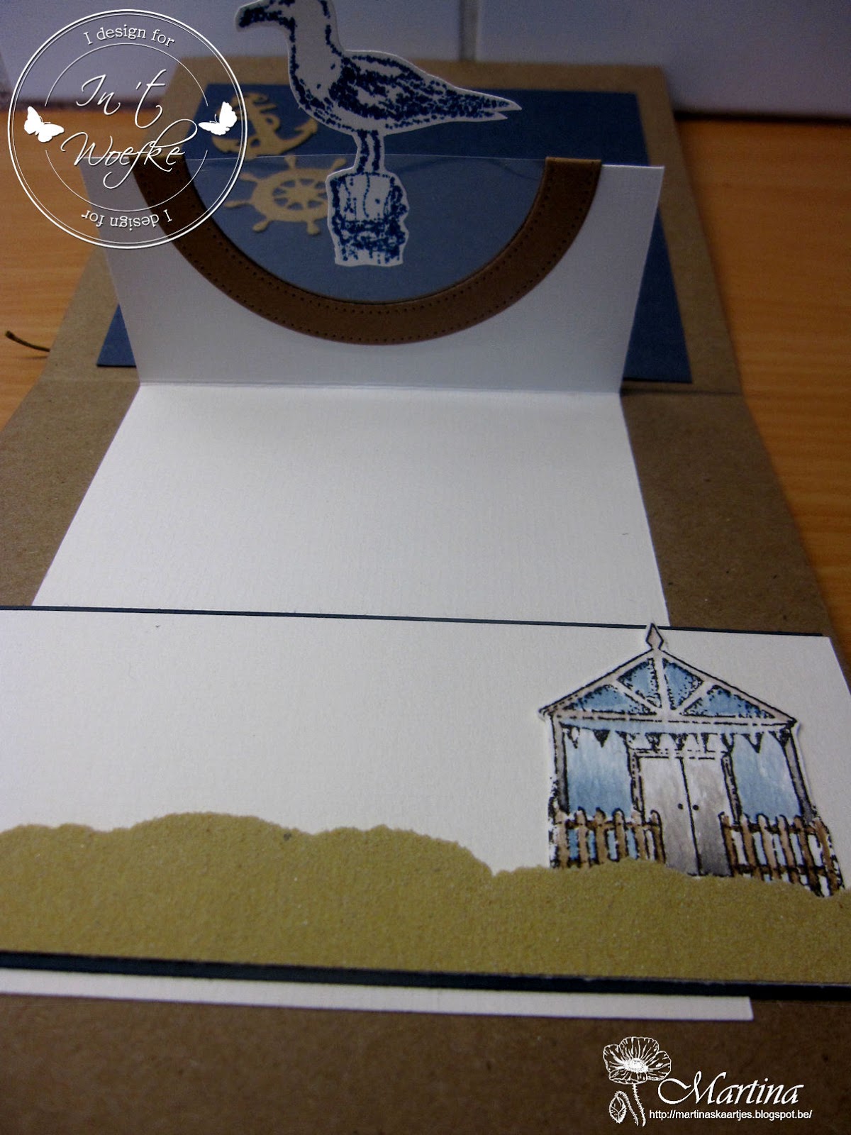
Vandaag nog een kaartje voor DT van In 't Woefke, de laatste in de rij met Chocolate Baroque. Vind het persoonlijk de mooiste van de drie. Thema strand, waar we nu enkel van kunnen dromen... deze kaart helpt je daar wat bij.
 
Today another card for In 't Woefke, the last of the Chocolate Baroque challenge. This is my favorite one of the three. The theme is beach, something we can only dream about this time of the year ... and this card surely helps.
 
 
Om het thema te versterken, gebruikte ik vooral zachte, blauw-bruin-grijze tinten.
Het modelletje gebruikte ik al een keertje voor een kerstkaart en een verjaardagskaart. In deze uitvoering is het dus ook perfect mogelijk.
 
I used primarely blue - brown - grey colors to enhance the theme.
This model I used for a Christmas card and a birthday card, but as you can see, it is suitable for all occasions.
 
Voor deze kaart, heb je een vierkante kaart nodig. Vooraan emboss je een vierkant vel met wolken.
Kleur je afdrukje in en plak het op je wolken. Scheur je schuurpapier in strookjes en breng onderaan aan. Stans de reddingsboei, leg knoopjes in het touw, plak het vooraan op je kaart.
 
First you need a square card. Take a piece of cardstock for the front and emboss with clouds. Color your stamp and attach it on the paper with clouds. Take some sanding paper and tear it in strokes that you attach on the bottom. Die cut a lifebelt, make knots in some twine cord and attach on the front of the card.
 
 
Binnenkant : Snij een stook wit papier, ril je strookje zodanig, dat je een 'opstaand' stukje in het midden hebt. De lengte aan de uiteinden bepaal je zelf.
 
The inside: Cut a piece of white paper, score this paper so you have a "mountain" in the middle. The length of the ends you choose yourself.
 
Snij een halve cirkel uit je opstande stukje wit paper, en ook eentje uit mica en dezelfde cirkel maar met rand uit ander papier (een soort halve cirkel frame), om het randje een beetje te camoufleren. Plak enkel de onderkant van de witte strook vast.
De andere kant (onder het blauwe stukje papier) plak je NIET vast, zodat het kan schuiven.
Je neemt een stukje blauw papier, dat groter en breder is dan je witte strook, bevestig enkel met plakband aan drie zijden, links rechts en aan de kant, NIET aan de binnenkant, waar je witte strook ingeschoven is...
 
Cut a demi circle out of the "mountain" piece of your white paper, and another one from a transparant sheet, and a demi circle frame to cover the edges.
Glue the bottom of the white paper in place. The other edge (that comes under the blue paper) you leave free, so it can slide under the blue paper.
Take some blue paper that is bigger and broader than your white paper and attach it on 3 sides (not the one where your white paper is) on the card...
 
 
Versier je blauwe stukje. Breng een strookje met nog andere versiering aan, onderaan je kaart.
 
Decorate the blue paper and add some extra decoration on the other side of your card.
 
Hopelijk is de uitleg een beetje duidelijk. Je kan altijd even langsgaan bij 't Woefke om de kaart te bekijken en uitleg te vragen aan Inge. Natuurlijk kan je dan ineens lekker shoppen om al je materiaal aan te schaffen ! =)
 
I hope I explained it well. You can Always visit In 't Woefke to see the card and ask Inge some more information. And then you can also shop for all the materials :)
 
Afdrukje / stamp: Chocolate Baroque, ingekleurd met / colored with Distress Inkt
Meeuw / Seagull : Joy
Wolken / clouds: Embossingfolder van Darice
Zand : Schuurpapier
Reddingsboei, anker, enz. / Lifebelt, anchor etc. : Joy
 
Ik wens jullie alvast een heel erg fijne, laatste werkdag toe en een fijn weekend !
 
I wish you all a great last workday of the week and enjoy your weekend !
 
Bedankt voor je bezoekje en tot de volgende,
 
Thanks for visiting and till next time,
 
groetjes, Martina
x

donderdag 21 januari 2016

Steampunk Funky Fish

 
Hallo iedereen,
 
Hi everyone,
 
Vandaag nog eens een Chocolate Baroque kaartje van mij met de leuke Steampunk Funky Fish.
 
Today I used another Chocolate Baroque for my card: Steampunk Funky Fish.
 
Eerst heb ik m'n kaart genomen en een strook in het midden met maskingtape afgelijnd, dan heb ik Distress inkt gebruikt om m'n achtergrond te blenden. De figuurtjes in de achtergrond zijn ook met een stempel uit de set Texture Fragments van Chocolate Baroque gemaakt.
 
First I took my card and used masking tape for the middle part of my card. I blended the background with Distress ink and the figures in the background were made with a stamp from the Chocolate Baroque set Texture Fragments.

 
De visjes heb ik op een apart stukje papier gestempeld en ingekleurd met Faber Castell aquarel potloden, tja, wat kan ik hierover zeggen? Ze kleuren zooo zalig in ! Echt fantastisch om mee te werken, en de kleuren die je gebruikt veranderen ook niet als je er water overzet, dat is wel anders bij Derwent, waar je kleuren helemaal kunnen veranderen.
 
Trouwens, er is ook een workshop gepland met deze aquarel potloden, kijk  maar op de workshop pagina, daarin kunnen jullie zelf werken met deze fantastische potloden !

 
The fish were stamped on a seperate piece of paper and then colored with Faber Castell watercolor pencils.... what can I say about these except WOW ! they are soooo nice to work with ! And the great thing is, the colors don't change like what you get with Derwent pencils.


Daarna heb ik de visjes uitgeknipt, en op de kaart waarop ik de achtergrond gemaakt heb gekleefd. Nog een stempeltje van m'n eigen collectie erbij in 2 kleuren, een gekleurde basiskaart en m'n kaartje is weeral af !
 
Next I fussy cut my fish and attached them on my background. I just added a stamp from my own collection in 2 colors, a colored basecard and there is my new card.
 
Hopelijk vinden jullie deze kaart net zo leuk als ik
 
I hope you like this card as much as I do
 
Groetjes
Inge

zondag 17 januari 2016

Under the sea ...

 
Dag Bloggers,
 
Hi Bloggers,
 
We zijn nog steeds januari, dus de opdracht luidt nog steeds om een kaart te maken met stempels van het merk ‘Chocolaee Baroque’.
Dus ging ik op zoek hoe ik ‘mijn eigen ding’ kon doen met deze stempels…
 
It's still January, so the challenge continues to work with the Chocolate Baroque stamps.
So again, I searched for a way to do my own thing with them ...
 
Ik had nog steeds mijn nieuwe fluo-inkten klaar liggen en vond een stempel die ik perfect bij de kleine Whimpsey-zeemeermin Goldie kon gebruiken.
 
I still had my new neon inkpads lying around and found a stamp that I could use with the little Whimsy mermaid Goldie.
 
 
Met groen en blauwe fluo-inkt stempelde ik de golfjes-achtergrond van Harlequin Fragments.
De Whimpsey-stempel zette ik zowel op de kaart, als op een plastieken kaartje.
Met de mal van Die-namics Peek a Boo wonky windows, stanste ik het raampje uit.
Ik kleefde  de plastiek achter het raam, zodat de tekening klopte met de voorkant van de kaart…
Zo is het net of onze ‘kleine zeemeermin’ verder zwemt in de zee…
 
 
I stamped the waves from the Harlequin Fragments with green and blue neon ink. Goldie was stamped on the card and on a transparant sheet.
The window was die cut with the Die-namics Peek a Boo wonky windows and I attached the transparant sheet behind it, so my stamped image of Goldie looks complete again. This way it looks like Goldie is swimming in the sea ...
 
Tot een volgend project alweer,
 
Till my next project again,
 
Liefs,
Nancy

zaterdag 16 januari 2016

Chocolate Baroque:The Art of Chess

 
Hallo iedereen,
 
Hi everyone,
 
Vandaag laat ik jullie weer een kaartje zien met de
Chocolate Baroque stempels, deze noemt: The Art of Chess,
deze kaart heeft een mannelijkere uitstraling,
maar kan even goed dienen voor ieder die van schaken houdt.
 
Today I'm showing you another card with a Chocolate Baroque stampset: The Art of Chess.
This card has a masculine look, but is suitable for anyone that loves this game.
 
 
Ik heb de stempel ingeïnkt met 2 kleuren Archival: Coffee en Orange Blossom op kraft papier; dan heb ik hier en daar enkele onderdelen ingekleurd of bijgekleurd met potloden (oker, donkerbruin en wit) zonder al te veel na te denken om wat kleur en diepte in de afdruk te brengen.
Ik heb het afdrukje uitgeknipt (de boog bovenaan is met een cirkelmal gedaan) en op donkerbruine cardstock gekleefd.
 
I inked the stamp with 2 colors of Archival inks: Coffee and Orange Blossom on Kraft paper, then I started coloring some parts with pencils (ocher, dark brown and white) to add dept and shade to my stamped image. I didn't think to hard and just added some color where I thought it was necessary.
Then I cut my image out (the rounded top was done with a circle die) and matted it on dark brown cardstock.

 
Op een ander stuk Kraft heb ik met een MFT stencil (checkerboard, heel toepasselijk LOL) en wat Rusty Hinge the vierkantjes geblend. De andere schaakstukken heb ik met Coffee op Kraftpapier gestempeld en uitgeknipt en daarna heb ik alles op een kaart van 10.5 x 21cm gekleefd.
 
On a seperate piece of Kraft paper I made the squares with a MFT stencil checkerboard (quite fitting don't you think :) ) and some Rusty Hinge. The other chess pieces were stamped with Coffee and fuzzy cut after which I attached them on a large card.
 
Hopelijk heeft deze kaart jullie weer geïnspireerd! 
 
Hope you're inspired by my card
 
Groetjes
 
Inge

vrijdag 15 januari 2016

Punky Flowers

 
Hallo iedereen,
 
Hi everyone,
 
Ook vandaag weer een kaart met de Chocolate Baroque stempels, deze keer heb ik gebruik gemaakt van de Punky Flowers ... die zijn zo leuk om mee te werken !
 
Today another card with the Chocolate Baroque stamps, this time I used the Punky Flowers set ... these are so much fun to work with !

 
Ik heb de bloemen op een strookje aquarel papier gestempeld, daarvoor heb ik ook de masking techniek gebruikt zodat sommige achter de andere bloemen liggen. Ik heb er ook 2 volledig op een apart stukje papier gestempeld alsook de harten van de bloemen (cirkels)
 
I stamped the flowers on a piece of watercolour paper, and I used the masking technique so some flowers are behind the others. I also stamped 2 complete flowers on a seperate piece and the flower hearts (circles).
 
Dan heb ik 3 kleuren Distress inkt gebruikt om ze in te kleuren: Mowed Lawn, Spiced Marmelade en Salty Ocean en ik heb ervoor gezorgd dat ik steeds van kleur afwisselde en dat ik dezelfde kleuren gebruikte op de bloemen die ik apart gestempeld had.
 
I used 3 colors Distress ink to colour them: Mowed Lawn, Spiced Marmelade and Salty Ocean and I made sure I alternated between these colors. I made sure I used the same colors on the flowers that I stamped on a seperate piece.
 
Daarna heb ik de bloemen en harten die ik apart gestempeld had uitgeknipt en op de juiste plaats op m'n strookje gekleefd, zo komen er enkele bloemen over de rand en is de kaart interessanter met het 3D effekt.
 
Next I fuzzy cut the flowers and hearts from the seperate piece and attached them on their place on top of the others with 3D foam.

 
Dezelfde kaart, maar in een andere richting ...
 
The same card, but in another direction ...
 
Zo, hopelijk inspireert dit jullie om ook aan de slag te gaan
met deze stempels, ik ben benieuwd ...
 
So, hopefully this inspires you also to get started with these stamps,
I'm looking forward to seeing them...
 
Groetjes
Inge